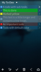
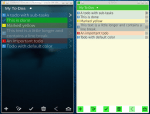
Yesterday evening and today, I put a little more work into the SailfishOS version of Q To-Do. Personally, I am quite happy with the results so far. It still needs some more work but I’m optimistic that when I finally get the long anticipated Jolla phone, Q To-Do will be ready as well. 🙂 I uploaded some screenshots of the current state as well as a picture comparing the Sailfish and desktop versions. Comments and suggestions are always appreciated.
Update: Q To-Do for #SailfishOS
This entry was posted in Announcements, My Applications, Q To-Do and tagged Jolla, Open Source, QML, Qt, SailfishOS, To-Do. Bookmark the permalink.

Looks cool. Maybe the entries could be a bit bigger? I am worried that maybe on the phone the text lines are not tall enough to select them precisely with the touchscreen. I think it would also better integrate into the rest of the sailfish os, which has generally big and touchfriendly objects and texts.
Thanks for your feedback. The font size is not fixed yet and is, essentially, based on the Sailfish Theme settings. I will take care that it will be easy to use.
Idea: pully menu instead of the toolbar on the bottom
This is not implemented right now but I surely consider using the menus provided by the Sailfish API.
One point about pully menus I am not really sure about is the usability in long lists, e.g., when a list has 200+ entries and I am somewhere in the middle, I probably wouldn’t like to scroll completely up/down just to add another item.
But I will look into this and hopefully come up with a good solution for this as well.
Thanks again for your feedback.
PS: I will also look into using things like item menus, remorse items/actions etc.
Hi @ruedigergad – I posted this on G+, and Cybette/Carol poked me to put it here as well. Please just consider it as thoughts as you develop:
I wonder why there isn’t more of a push to use the gestures as the primary UI for this app rather than buttons. Would seem like in using a clean sheet platform like #SailfishOS that a gesture to delete and one to mark completed would be ideal. Then instead of icons, it would be a pulley menu to do other items (except for creating a new item, I’ve should only have to tap on an always blank area of the app screen to start a new one).
Just thoughts.
–end–
I wasn’t aware that it was a port of the existing Meego/BB10 app. I therefore miss(ed) on much of the UX work you’ve done already. I’ll have to play on my N9 and offer a better set of comments… and then get my hands on one of those Jolla devices to be an appropriate tester/commenter :p
Thanks for the feedback. Using gestures is indeed a cool idea as well. Btw. for navigating the tree of todos I already use swipe left/right as primary navigation; in that case the icons are just there as a sort of hint and for people that don’t like swipe gestures.
This is a pretty old video I made from one of the first working prototypes of my tree view: http://www.youtube.com/watch?v=nbCKIwoUTZM
Maybe this can show the idea better than just static images.
Pingback: Update: Q To-Do for #SailfishOS – Ready when you are. ;) | ruedigergad