MeeGo / Harmattan comes with quite nice QML components like Buttons, Dialogs, and the like. Unfortunately these components are not available for Maemo Fremantle (N900). There is a qt-components package in extras-devel but there also seem to be some issues connected with this; besides, using packages from extras-devel prohibits promotion to extras-testing and extras.
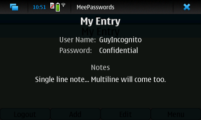
Inspired by QmlComponentsButton I decided to also create some “custom” components in order to port my QML based Harmattan application (MeePasswords) to Fremantle. I started by reimplementing the simple dialog. Thereby I tried to give it the look and feel of a MeeGo / Harmattan Dialog. The following picture shows a dialog with customized content in MeePasswords on Fremantle (N900).
import Qt 4.7

Rectangle {
    id: dialog
    anchors.fill: parent

    visible: true

    color: "black"
    opacity: 0

    z: 32

    signal opened()
    signal rejected()

    Behavior on opacity { PropertyAnimation { duration: 200 } }

    MouseArea{
        id: area
        anchors.fill: parent
        visible: dialog.visible

        onClicked: {
            close();
            rejected();
        }
    }

    function close(){
        opacity = 0
    }

    function open(){
        opacity = 0.9
        opened()
    }

    property Item content: Item{}

    onContentChanged: content.parent = dialog
}
Then you can use this dialog like this (assumed you stored the above code in a file called “Dialog.qml” which is located in the same directory as the file containing the following snippet):
import Qt 4.7

...
    Dialog {
        id: myDialog
        content: Text { text: "Foo Dialog"; color: "white" }
        onRejected: console.log("Dialog closed.")
    }
...
Based on this dialog I also created a MessageDialog and a ConfirmationDialog.
import Qt 4.7

Dialog {
    id: messageDialog

    property alias text: message.text

    content: Text{
        id:message
        anchors.centerIn: parent
        width: parent.width
        color: "white"
        font.pointSize: 25
        horizontalAlignment: Text.AlignHCenter
        wrapMode: Text.Wrap
    }
}
Dialog {
    id: confirmationDialog

    property alias titleText: titleText.text
    property alias message: message.text

    signal accepted();

    Text{
        id: titleText
        anchors.bottom: message.top
        anchors.margins: 20
        width: parent.width
        color: "white"
        font.pointSize: 40
        font.bold: true
        horizontalAlignment: Text.AlignHCenter
        wrapMode: Text.Wrap
    }

    Text{
        id:message
        anchors.centerIn: parent
        width: parent.width
        color: "white"
        font.pointSize: 25
        horizontalAlignment: Text.AlignHCenter
        wrapMode: Text.Wrap
    }

    Button{
        id: acceptButton
        text: "OK"
        anchors.top: message.bottom
        anchors.topMargin: 20
        anchors.horizontalCenter: parent.horizontalCenter
        width: parent.width * 0.5
        onClicked: {
            close()
            accepted()
        }
    }

    Button{
        id: rejectButton
        text: "Cancel"
        anchors.top: acceptButton.bottom
        anchors.topMargin: 10
        anchors.horizontalCenter: parent.horizontalCenter
        width: parent.width * 0.5
        onClicked: {
            close()
            rejected()
        }
    }
}
Not that the ConfirmationDialog uses the Button linked above.

This work is licensed under a Creative Commons Attribution-ShareAlike 3.0 Unported License.


Pingback: QML Text Input for Maemo Fremantle « ruedigergad
Pingback: Share QML Code among Fremantle and Harmattan « ruedigergad